Sartorelli Eugenio Investimentivicenti

Cyclical Analysis: Sentiment Indicators on the S&P500, Current Phase

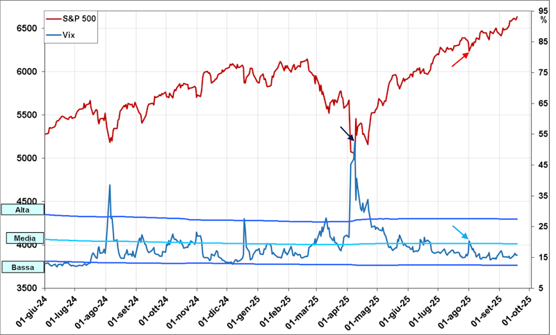
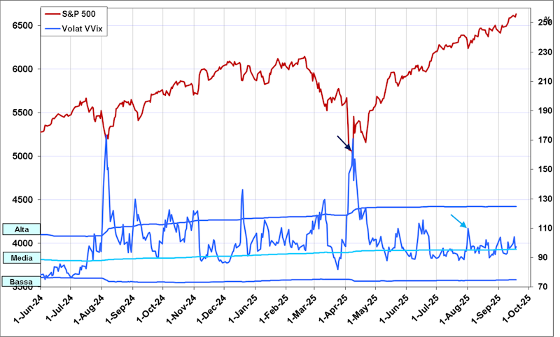
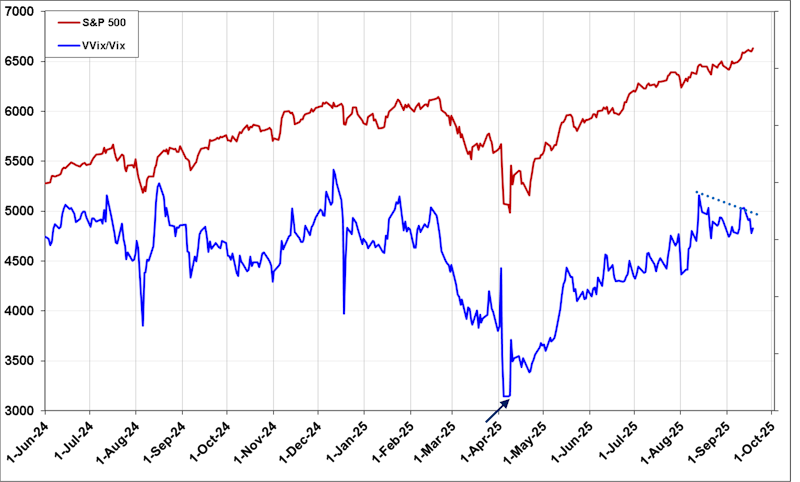
Cyclical Analysis: Let’s see what some indicators derived from the Implied Volatility and Options market can tell us about the world’s primary market, the USA.


Reproduction prohibited in any form, even partial


We’ll start with the classic Implied Volatility Index, the VIX (daily data from June 2024 through the afternoon of September 19th):

This indicator has the classic contrarian relationship with the S&P500 Index and, most importantly, makes very pronounced peaks corresponding to market lows, as can be easily seen from the chart; this is why it is also called the “fear index.”
This year, the VIX made a significant peak high on April 8th (see blue arrow) with values near 52 points; we hadn’t seen values that high since March 2020. The last notable VIX high was made on August 1st (see light blue arrow), coinciding with a not particularly pronounced low in the S&P500 (see red arrow). Since mid-August, the VIX has been at rather low levels and below its long-term average. To have signals of tension in the markets, the VIX should at least surpass the 20-point threshold.

Let’s also look at another sentiment indicator linked to Volatility: the chart of the VVIX (daily data):

The VVIX Index is linked to the Volatility of the VIX Index, on which one can trade futures and options. The VVIX Index has characteristics similar to the VIX but can be an amplifier of Volatility and sometimes a leading indicator.
Here too, the VVIX made a high peak on April 8th (see blue arrow) in conjunction with the S&P500 low. More recently, the VVIX made a high on August 1st. The similarities with the VIX chart are notable. There is one evident difference: the VVIX is hovering around its long-term average, meaning it hasn’t managed to fall to levels indicating greater “tranquility.”

At this point, all that’s left is to show the VVIX/VIX Ratio:

Without going into too many details about this indicator, it often provides confirmation or denial of potential turning points. As you can see, there was a low in this indicator on April 7th-8th (see blue arrow), after which it rose. However, since its peak high on August 13th, it has been in decline (see dotted light blue line). This is a clear divergence compared to the rising trend of the S&P500, denoting clear concerns about the sustainability of the current upward trend in the S&P500.


Reproduction prohibited in any form, even partial

Disclaimer

The contents of these notes and the opinions expressed should in no way be regarded as an invitation to invest. The analyses do not constitute a solicitation to buy or sell any financial instrument.The purpose of these notes is financial analysis and investment research. Where recommendations are made, they are of a general nature, are addressed to an indistinct audience and lack the element of personalisation. Although the result of extensive analysis, the information contained in these notes may contain errors. Under no circumstances can the authors be held liable for any choices made by readers on the basis of such erroneous information.erroneous information. Anyone deciding to carry out any financial transaction on the basis of the information contained in the site does so assuming full responsibility.


Subscribe to Our Newsletter
I have read the Privacy policyand I authorize the processing of my personal data for the purposes indicated therein.

Newsletter ETFWorld.co.uk

I have read the Privacy policyand I authorize the processing of my personal data for the purposes indicated therein.